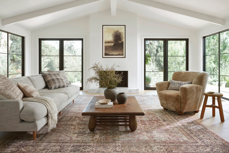
Lifestyle blogger Alaina Kaczmarski's Chicago Greystone is an absolute dream. The beautifully curated, yet cozy house boasts a mood both relaxed and sophisticated. Glistening white walls and monochromatic art and decor create a subtly comfortable aesthetic. And plush furnishings and accent pieces in brass and bronze highlight a palette of luxurious blacks, creams, and taupes, all of which are perfectly tied together by her choice of a Loloi Loren rug. Earlier this year, we sat down with Alaina to discuss how she discovered her Greystone that was once in “pretty bad shape,” her old-meets-new style, and what she values in a good rug.
My husband and I moved into this 1887 Chicago Greystone a little over a year ago. I saw the listing on Craigslist and immediately recognized the floor plan and architectural details as reminiscent of a Brooklyn Brownstone. The likes of which I have pinned many times over the past six years. It was in rough shape, but I knew it had potential. But believe it or not—we rent. Yes… it’s a rare occurrence to find a two-story townhome with original stair railing and marble fireplace to buy let alone rent. But as I said, it was in pretty bad shape—dated doesn’t quite describe the kitchen, baths, carpet, staircase... worn and derelict are better descriptors. But we took it upon ourselves—yes, as renters—to fix some things up and make it our home.

When selecting furnishings, it was important to me to stick with the home’s traditional roots—lucky for us a wave of New Victorian home decor style had just resurged. Of course we didn’t want the home to feel stuffy or dated. We wanted warm, cozy, inviting, blending old and new.

We wanted something light and muted to brighten the space.
We wanted something that would blend with the “fresh traditional” look we were going for.
We needed something durable. We have two dogs, and the living room is basically a thoroughfare from the front door to the dining room and kitchen, so people are constantly walking across it.
We wanted it to be large enough to fill the space, making the seating area feel roomier and larger than it is.
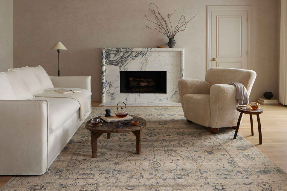
The muted, warm hues of the Sand/Taupe color option provide the perfect amount of brightness and texture to the living room—and I love that the subtle color disparities within it pick up on other accents in the room. A touch of gold here mimics the oversized gilded mirror above the mantel. The touches of silver and blue contrast the dark brown velvet chairs. And of course the warm compliments the roll arm sofa that sits atop it.

I also love knowing this neutral, classic design could easily work in any other room of our home: I’m already scheming that it would fit perfectly and completely transform the look of our bedroom. But for now—it's perfect right where it is.


